
Why it looks 'amazing': The foundational rules of visual composition
Have you ever looked at a shot from a game or movie and thought, “Wow! That looks amazing, but I’m not sure why”? Well, that’s the power of good composition.
But what is composition? And what is it that makes one particularly good?
A great scene relies on several key elements: lighting, color, a compelling subject (maybe even a puppy), and crucially, composition.
As an artist – whether you work in traditional painting, 2D, or 3D (for gaming, interactive, or film – you need to understand what makes an image work. We instinctively react to images, sensing whether they feel happy, scary, or calm. It’s your job to use those cues intentionally.
Composition is the thoughtful selection and arrangement of all the elements in your scene. Understanding this skill is an essential tool for any creative.
In this article, we’ll discuss the importance of composition and the tools you can use to help you create amazing, memorable images!
What do we want to achieve with composition?
Generally, there are three main things composition is trying to achieve:
Firstly, we can use composition as a tool to control readability. We can guide the viewer’s eye so they focus on the intended elements or actions. This helps with understanding the image and reduces visual clutter. Even the most compelling subject can be lost in an image that’s not properly composed.
Secondly, the composition can set the mood. Colors, lines, shapes, and textures can all contribute to the overall emotional tone.
And lastly, the composition should be interesting. There are countless ways to make a scene more appealing or, if the story calls for it, deliberately ugly, cluttered, or chaotic. Creativity often comes from seizing an opportunity to try something original. Rules can be broken, and the same story can be told in many different ways. Having a strong vision or a unique expression can lead to wonderful, unique work.
Understanding the basic rules of appealing composition is a great starting point. Once we know how to structure an image, we can start breaking those rules to create something truly compelling.
Directing attention
In general, our eyes are drawn to high-value contrast. In this image from the game Ori and the Blind Forest, there’s a lot of visual clutter going on, but our eye is immediately drawn to the characters in the center. This is done by creating a big difference in value between the character in the foreground and the mountain in the background.
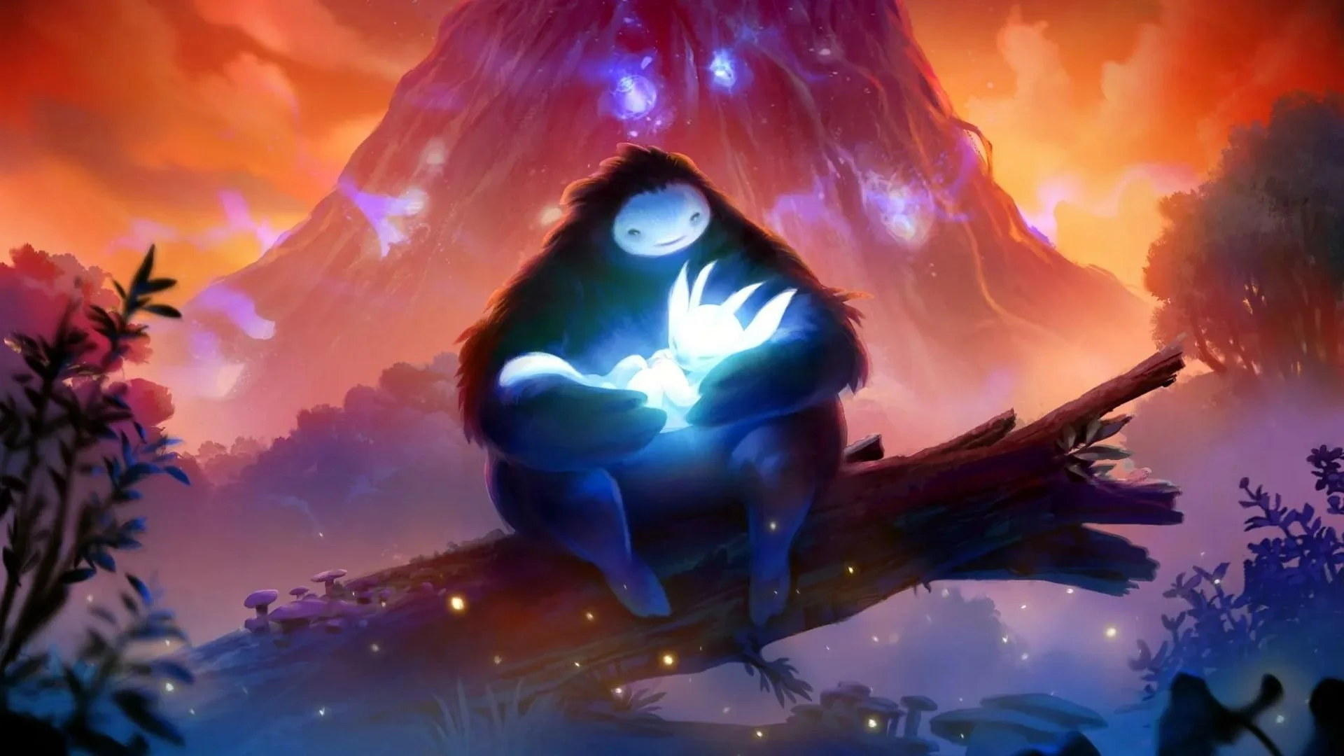
You can check the values of an image by turning it black and white. In this example, the values of the characters at the front range from almost black to almost full white. This contrast draws our eye to the intended focal point of the image. It communicates to the player that this is the most important thing in the scene. If you’re looking to recreate the value levels in this image, a great way to reduce the contrast of the background is to add fog.

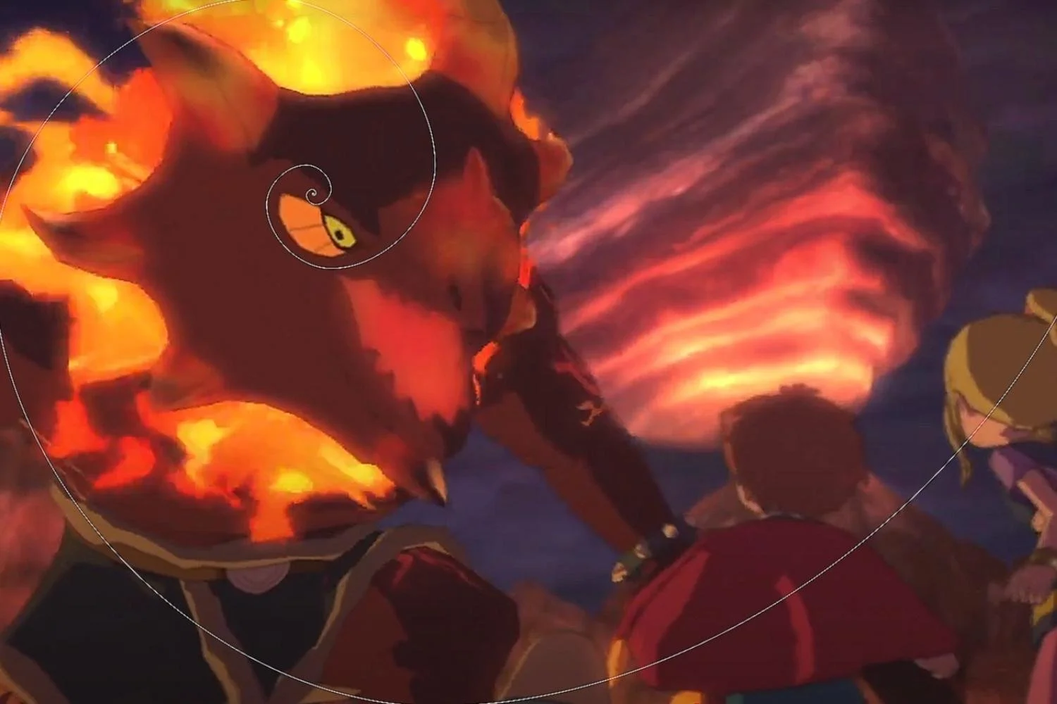
However, something else to consider is that contrast isn’t just value; it’s also impacted by color choices. In the first image, we can see that the background is orange and the foreground blue. These colors are complementary – they contrast each other strongly.
Another good example of this can be seen in the game Hades.
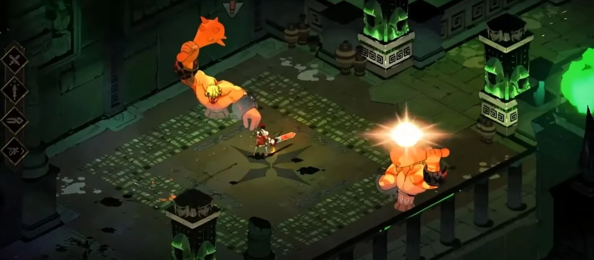
The first thing that stands out in the above image is the orange monsters and our red main character. They achieve a heavy contrast against the dark, muted green background due to their distinct colors. It's important to note that the main elements are very bright and saturated, while the background is deliberately subdued. Since the most saturated part of an image draws focus, the bright green pillars are intended to guide the viewer's eye.
However, the monsters are also bright, saturated, and a complementary color. On top of that, they move, so they'll draw focus even more than the pillars. The player's first read of this area will therefore be the monsters, the second the pillars, and thirdly, everything else. Paying attention to these visual hierarchies makes for a better player experience, as it gives you control over their focus.
Another simple way to direct focus is brightness. If you want the viewer to look at what’s on the table in a scene, put a light on it! This immediately feels like something important that the viewer (or player) will want to investigate.
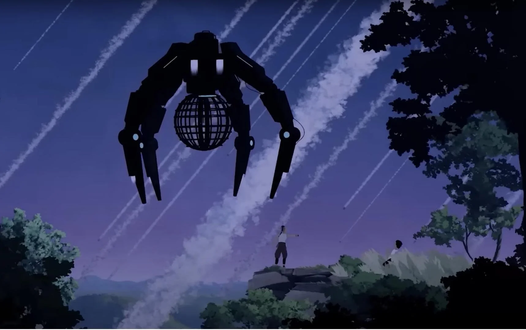
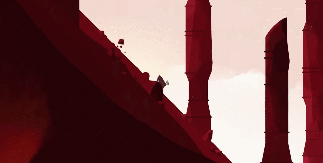
Sometimes a subject can stand out just by its shape, particularly when it feels like it doesn’t belong in the landscape. Take this machine, for example; it stands out as a threatening presence in a peaceful environment.
Lines are another key composition tool, especially those that point at your subject. We can see in this example from Kena: Bridge of Spirits that there are many lines in this environment. The branches pointing at the center are all functioning as arrows pointing at our figure. It’s making him look bigger and more menacing.
Source: Kena: Bridge of Spirits
An object with a sharp point, like the sword in this scene, is a strong tool. It functions similarly to a line by directing the viewer's gaze, but the sharp tip introduces an element of tension and focus that demands attention.
Source: The Blood of Dawnwalker
Eyes, faces, and even hands have a similar effect. As human beings, we are very attuned to reading facial expressions and body language. If there’s something even remotely human in an image, our eyes will be drawn to it, follow its line of sight, and interpret the hand gestures.
An interrupted pattern is a powerful artistic tool. When a sequence is broken by an odd element, it immediately draws our attention. A regular pattern can function almost like a solid surface or background in a scene. Therefore, anything that disrupts this pattern will naturally become the focal point.

Lastly, movement. We all know that movement is relative, so if your subject is moving with a background which is standing still, it will stand out. Alternatively, if the background is moving and your subject is the only thing that’s not, that works too. We can use all of these things to guide our focus to subjects in our work!
Examples of compositions
Now that we know how to direct focus, it’s time to start playing with composition to tell our stories and set a mood. There are many tools we can use to achieve this, let's take a look!
Points
One of the simplest compositions involves reducing the detail in a scene to only one point of interest. The eye is naturally pulled towards this focal element because it stands out as the only visual anchor.

Source: Hades (Animated Trailer)
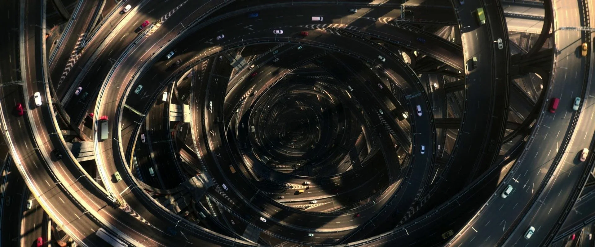
Lines
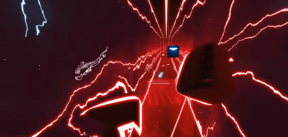
As mentioned earlier, lines can guide a viewer's eyes to a subject. Beat Saber, a VR rhythm game, uses concentric lines to keep your attention straight on the center of the action. In VR, you have the option to look in any direction, but because of the way it’s framed, you’re hypnotized.
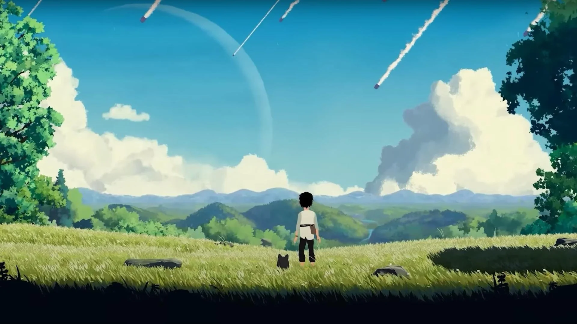
Different sorts of lines will also affect the mood of an image. For example, in this image from Planet of Lana, we can see how horizontal lines can evoke a feeling of calm and serenity.

Whereas in this image, there is a stark contrast between the serene horizontal line of the landscape and the diagonal way the aliens are invading. Clearly, they don’t belong there and disturb the peace.
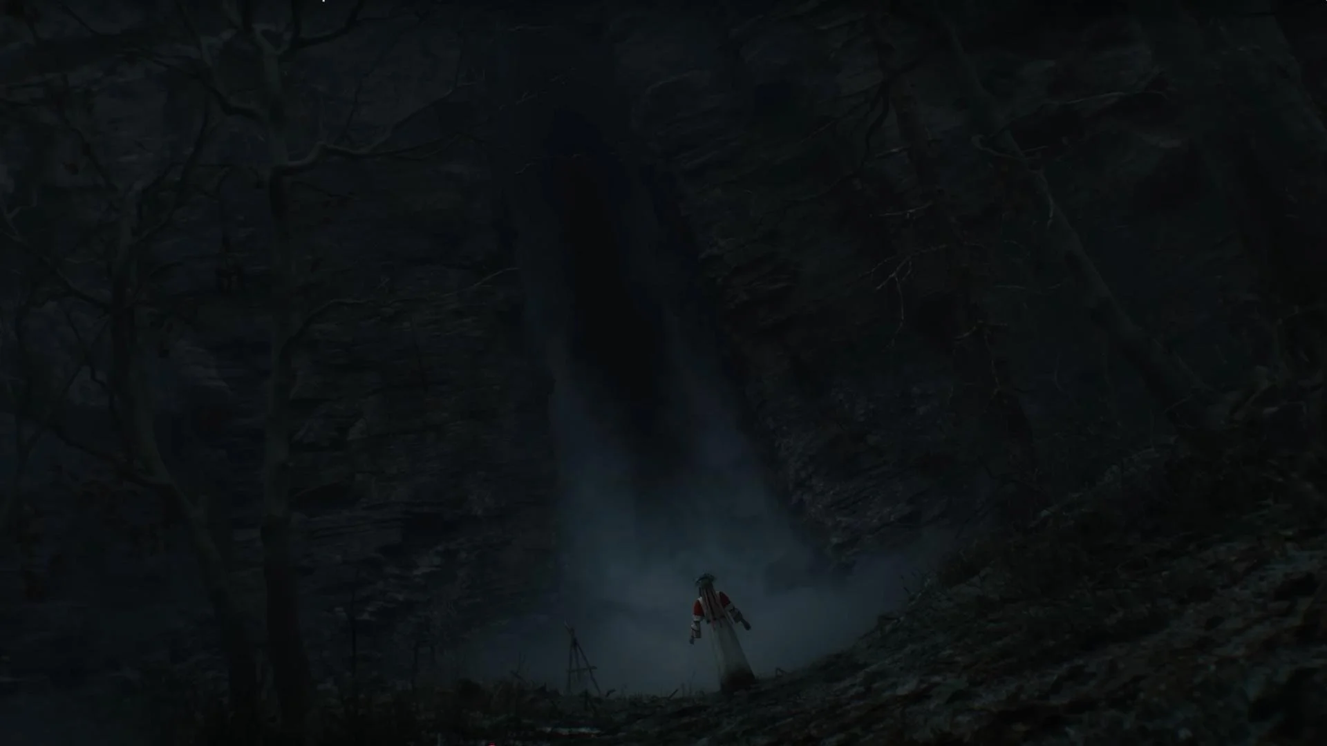
A more vertical line will look more imposing; it makes the subject look small, like the task ahead is daunting. In the case of this image from The Witcher 4, they’ve played with scale, making the character feel very small compared to the vast cave.
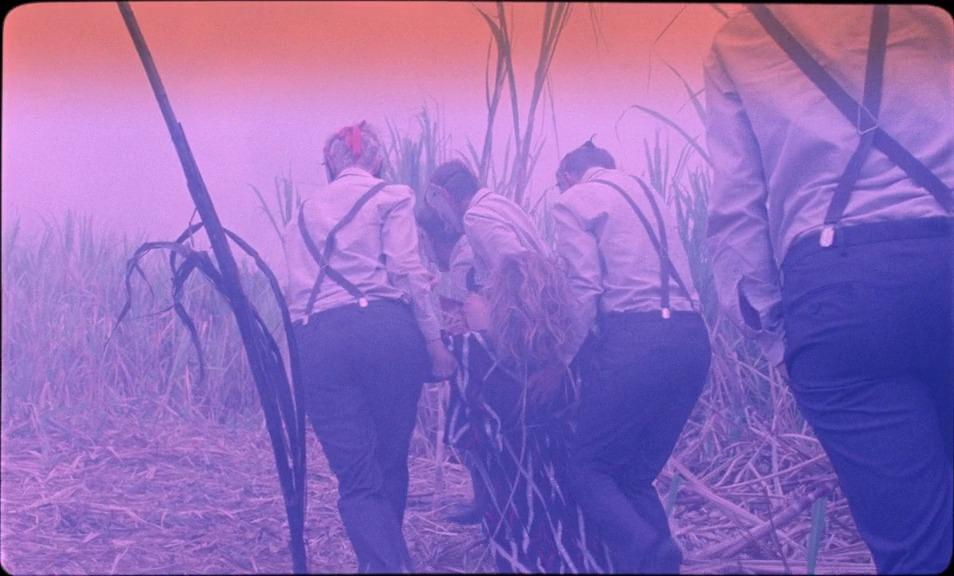
Meanwhile, curved lines can look either elegant or chaotic depending on whether they bend in an organized or disorganized way. The curved lines in the first image create a stressful atmosphere, whereas in contrast, the second image has a calm, clean aesthetic.
Source: Three Thousand Years of Longing
Source: Blade Runner 2049
Camera angles
Depending on the position of your camera, you can communicate different dynamics. Putting the camera at eye height feels pretty neutral, as though the viewer is on the same wavelength as the character in the scene.
Source: Addams Family Values
However, when we put the camera lower than the character, suddenly they look imposing and scary; an intimidating presence in the scene.

Source: Addams Family Values
A high camera angle achieves the opposite effect: it diminishes the subject. This perspective makes the character appear less powerful or physically smaller, suggesting they are humbled, not in control, or in immediate danger. This angle can also create the feeling that the subject is being watched.
Space in the frame
The space where the character is looking is known as the “lead room” or the “looking room”. Typically, you want to keep the space in front of a character larger than the space behind. This visually prevents the character from feeling confined, and is the standard approach for simple scenes or conversations because the resulting composition feels natural. It just feels nice.
Source: The White Tiger
Doing the opposite feels off, like the character isn’t really there mentally. It creates tension. This imbalance can be used intentionally to suggest a feeling of unease or mystery.

Source: The White Tiger
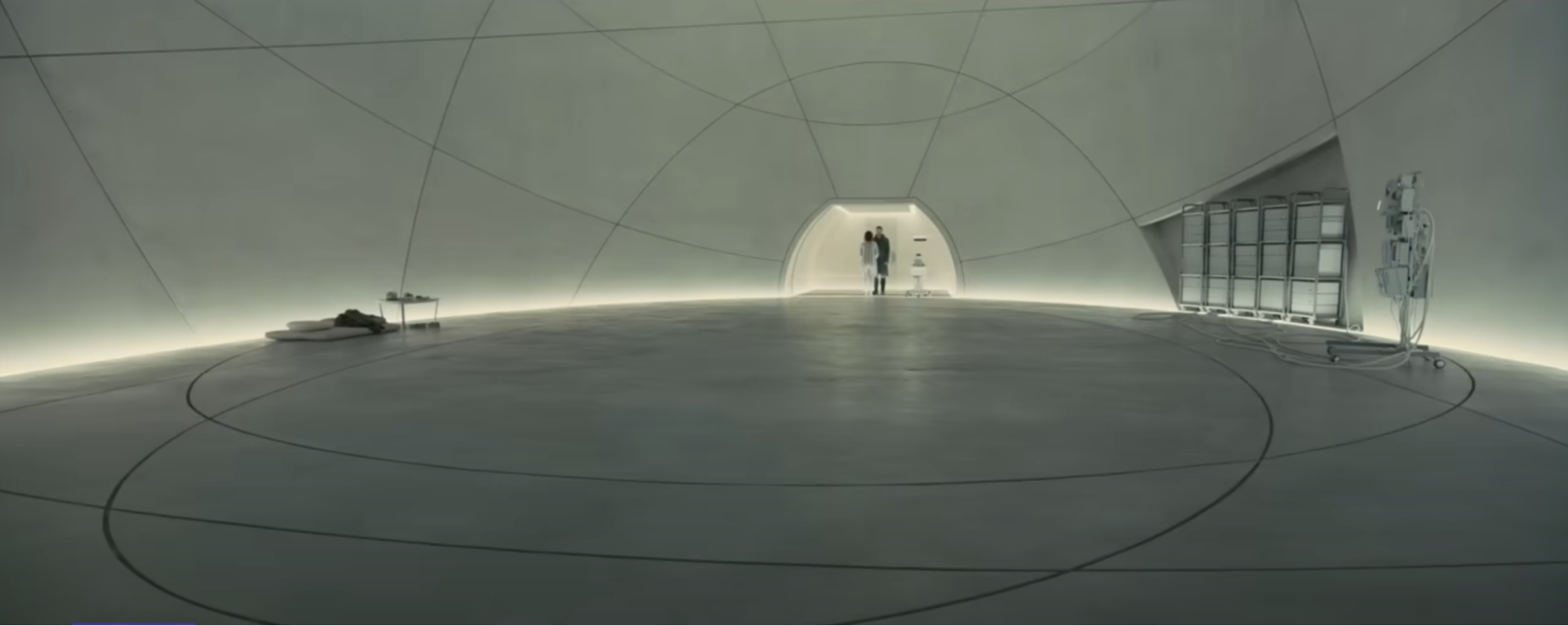
The space taken up by the subject is called positive space; the rest is negative space. Playing with the amount of space around the subject can give different effects. We feel relatively close to characters that are big in the frame.

Source: The Empty Man
In contrast, a larger amount of negative space makes our character feel small, and the world more dominant. This can often help a scene to feel more serene.

Source: The Empty Man
Making your character smaller in the frame can also help create an establishing shot. It shows the viewer where they are and what the setting is.
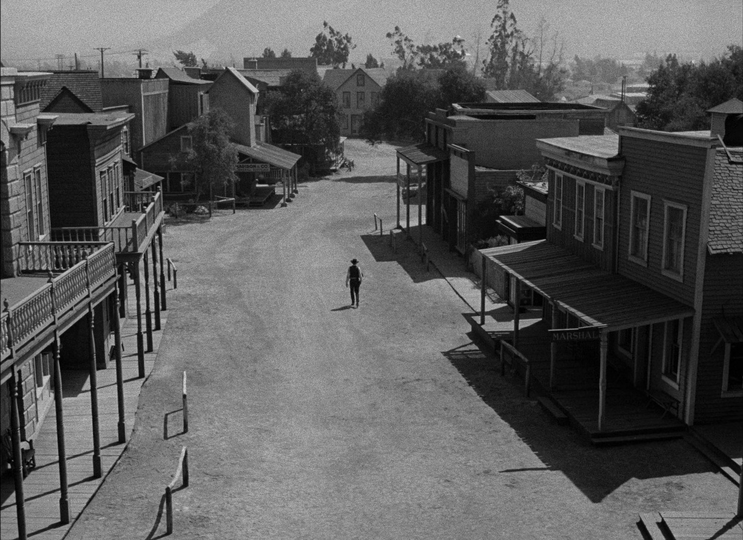
Source: High Noon (1952)
We can also fill the frame by getting really close to our character. It can feel intimate, uncomfortable even, placing us in direct connection with the emotion that the character is experiencing.
The space above a character’s head is called “headspace”. Typically, it’s kept to a minimum, but in Mr Robot, it was used to emphasize the character’s isolation. This creates a feeling of imbalance. Just like dissonance in music makes us crave the resolution of consonance, this kind of framing builds tension and drives the story forward.

Source: Mr Robot
In gameplay, your camera options are different. The camera positions are mostly determined by gameplay considerations that usually outweigh the artistic sensibilities, but these techniques can still be used, especially in cutscenes or narrative-driven moments.

Depth
Depth of field is a powerful tool when it comes to composition. In film or photography, depth of field can be adjusted by changing the aperture on your camera. Aperture determines how much of the scene stays in focus. In games or other virtual spaces, the same tools are generally available within the renderer or engine you use.
Adjusting the depth of field can give different effects. Having a narrow depth of field can make the viewer focus on a specific object. For example, in the image below, the depth of field enhances the storytelling by making the viewer focus on the character's phone rather than her face.

Source: Promising Young Woman
On the other hand, a large depth of field can make a scene feel cluttered. In this shot, we see a woman blending into the pet shop, which works narratively, but it can be visually overwhelming.

Source: Cat People (1942)
Another reason to use a large depth of field can be to show the scale of a city or an army. Allowing the viewer to see the large scale of something can create a sense of awe or intimidation, depending on the narrative need!
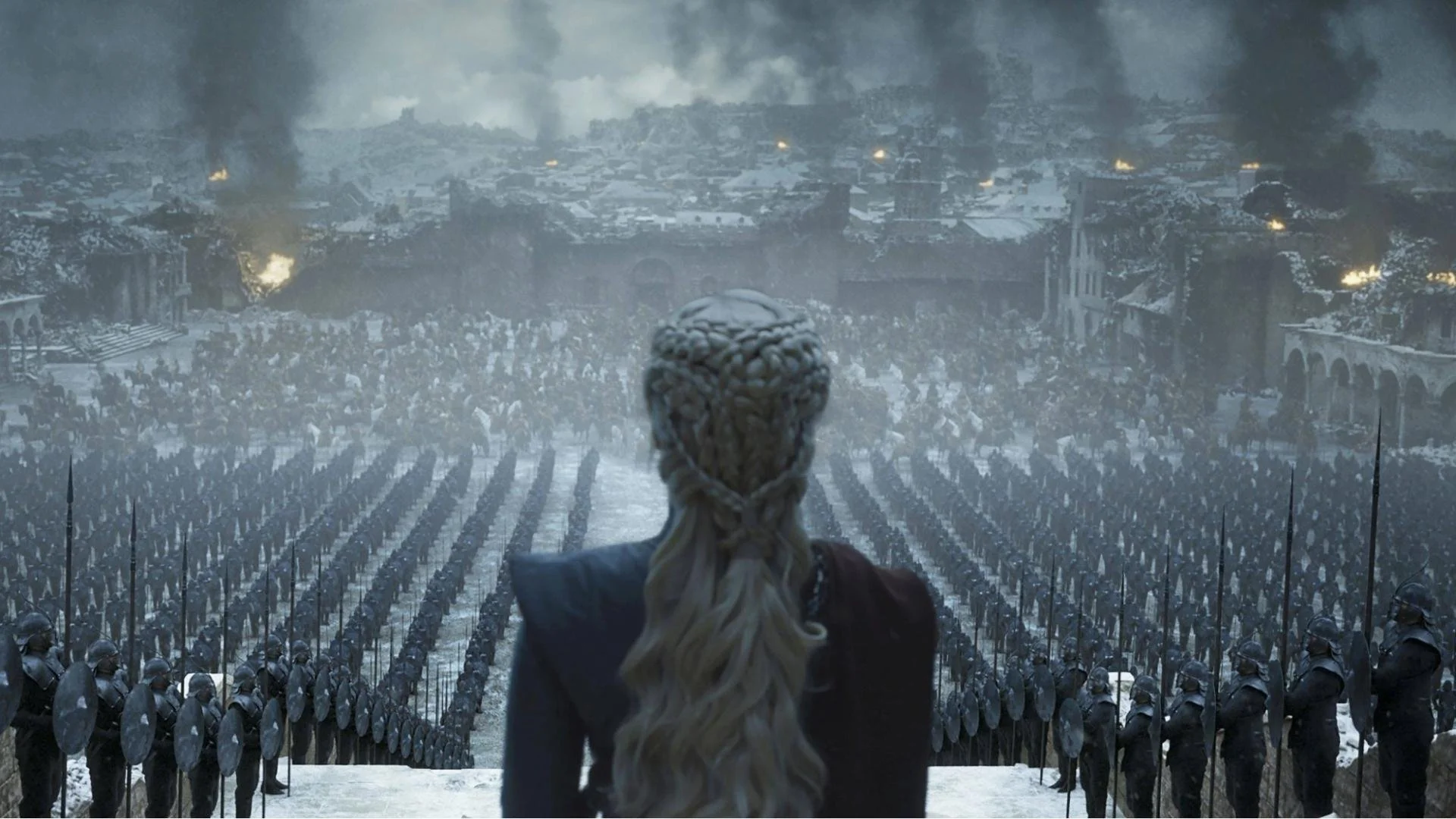
Source: Game of Thrones (Season 8)
Something to note is that establishing shots often have a large depth of field, while the shots with the actual action have a narrower depth of field.
Another fundamental way to enhance visual depth is to establish clear foreground, midground, and background layers within a shot. Giving viewers these distinct layers to explore makes the image feel more dimensional. Generally, a shot with this layered structure will be more visually engaging than one presenting a single, flat layer.


Source: The French Dispatch
However, sometimes a director will intentionally create an entirely flat set, which gives a very interesting, distinct feel. This demonstrates that there's more than one way to make an image compelling. What works beautifully for one project may not work for another, and seeing that wide variety of creative possibilities is what makes the whole process so engaging.
Overlaying grids
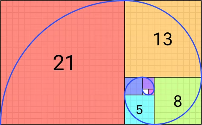
The Fibonacci spiral
Mathematically, the Fibonacci spiral is constructed using squares with side lengths corresponding to the numbers in the Fibonacci sequence (0, 1, 1, 2, 3, 5, 8, ...), where each number is the sum of the two preceding ones. A quarter-circle arc is drawn within each successive square, connecting its corners to form a continuous spiral that expands outwards. The Fibonacci sequence approaches the golden ratio as the numbers increase.
In nature, this is the most efficient way to arrange seeds or petals, which is why we see spirals in things like sunflower heads. Once you start looking, you’ll spot the spiral everywhere!

It turns out our eyes like to follow this direction. It feels pleasing – dynamic, yet orderly. For a very long time, the Fibonacci spiral and the golden ratio have been considered aesthetically pleasing and harmonious.

Leonardo Da Vinci, for example, used them heavily. He even wrote a book, Da Divina Proportione (On the Divine Proportions), discussing the golden ratio, its beauty, and its philosophical implications.
The Fibonacci spiral is still used today; people use it as a guide to align elements to create pleasing images, even in games.
Most of the time, it’s simplified into the rule of thirds, which can be easily applied when photographing, filming, or composing. You just need to align the most important element of the image with one of the guides.
Another tool is a dynamic symmetry grid. Aligning certain elements with its lines and intersection points on the grid can make a complex composition feel balanced, structured, and visually appealing.
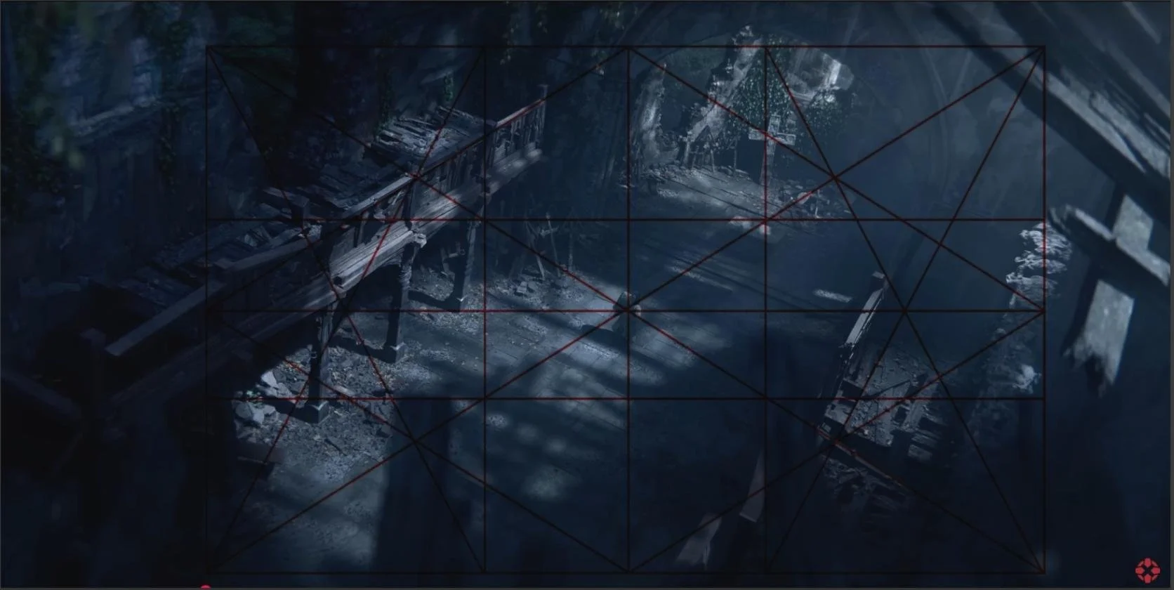
Source: The Blood of Dawnwalker
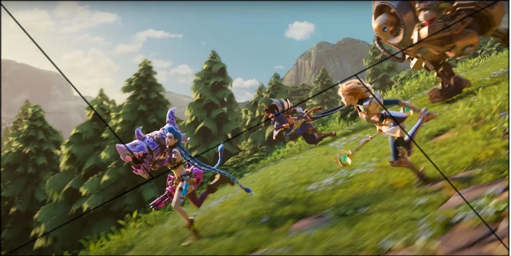
There’s also the golden triangle, which is based on the golden ratio. It helps with diagonal compositions.
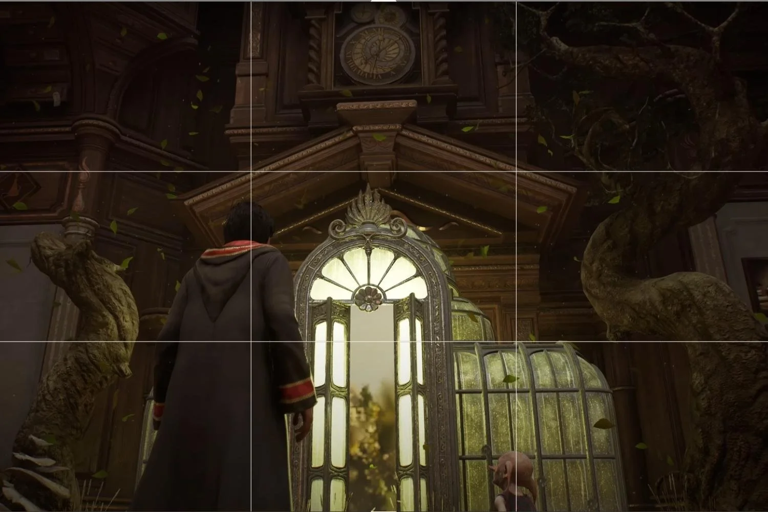
Frames within frames
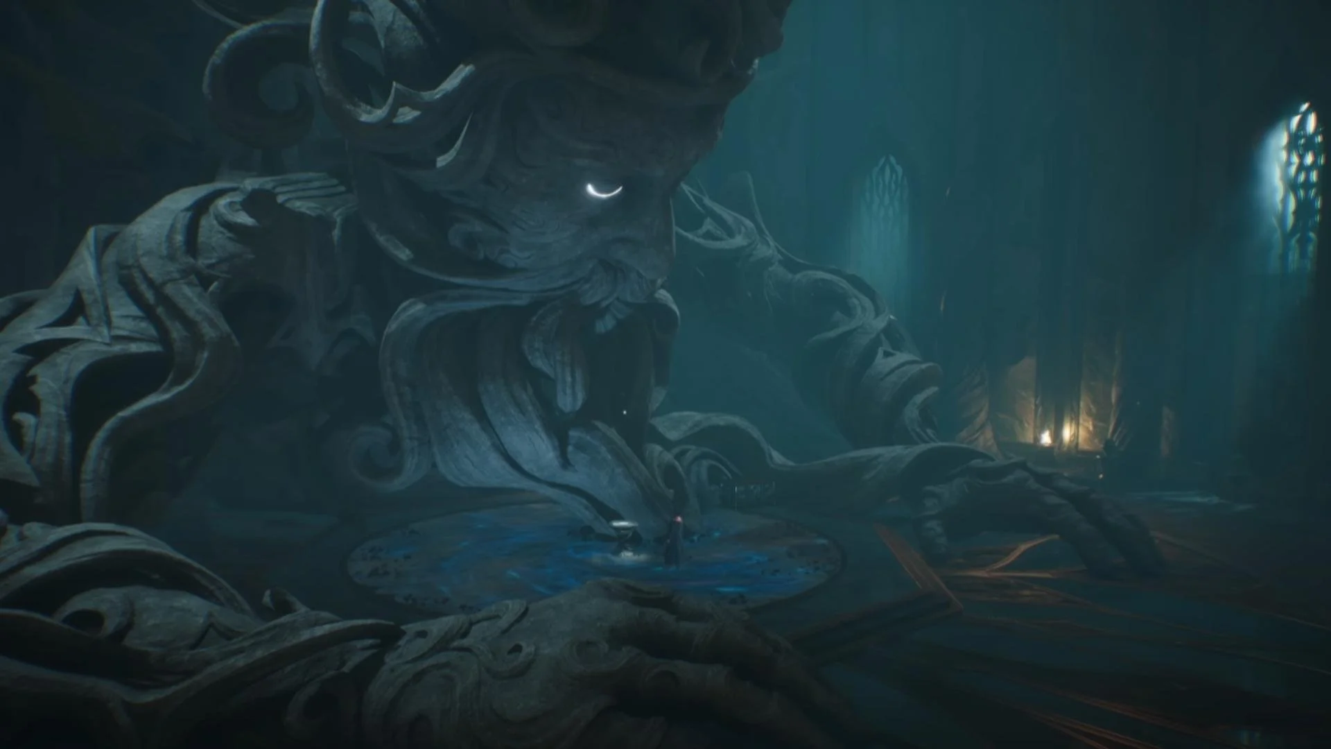
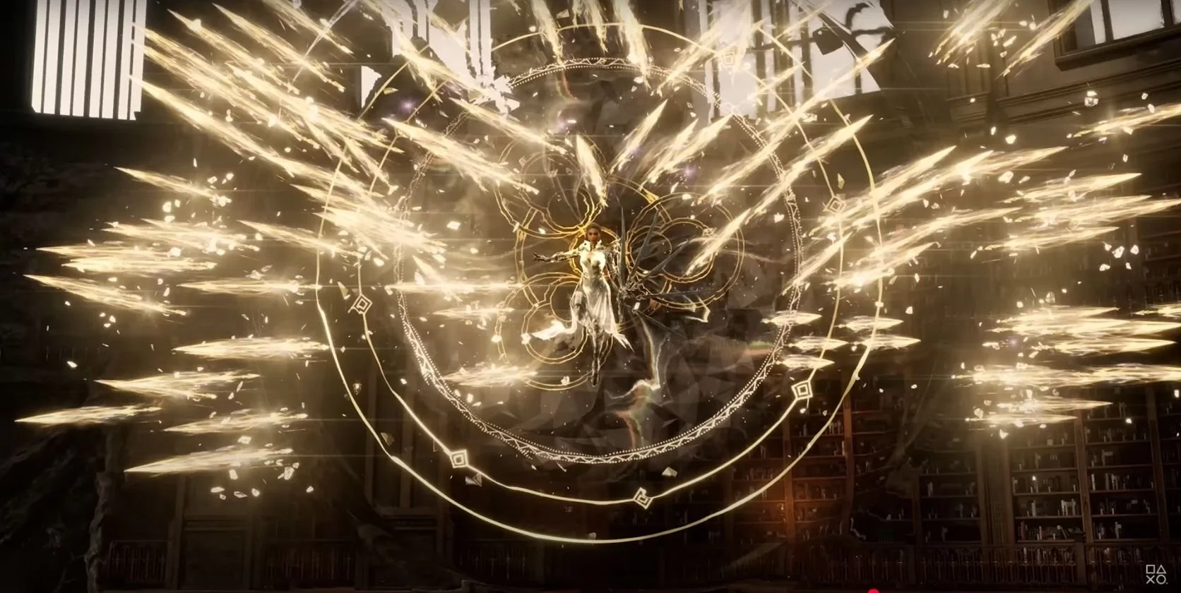
Another way to add emphasis to an element within your shot is to use a frame within a frame. Here we can see the character framed by the magical spheres, making her appear grand and epic.
This can also be a handy tool for more than just characters. For example, in this image, the window acts as a frame for the statue. It feels orderly, provides a nice rim light, and makes the silhouette stand out clearly.
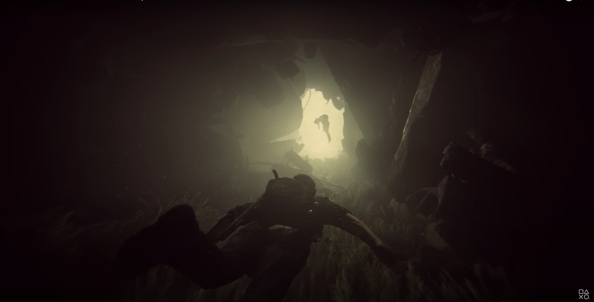
In this example, the character in the distance is framed by the walls of the tunnel. The light pooling behind her is making her silhouette stand out very clearly, giving the player narrative direction. She would probably be invisible or quite obstructed if she were positioned anywhere else. Element placement in scenes is very important to take into account!
Adding texture
When done correctly, texture added to an image can evoke other senses. For example, a skilled classical painter can make fabric look so real that we almost know what it would be like to touch it. We all know the sensation of grass slipping through our fingers, splashing in a puddle, or feeling the warmth of a campfire. Seeing images of these experiences can unconsciously bring back memories of when we felt them ourselves, creating a more engaging and immersive experience.
The trailer of the 4th Witcher game starts with a series of images just like this, evoking a range of feelings. First flowers floating in water; we can picture how these would feel to touch, can imagine the cool water.

Then a man sitting by the glow of a campfire, feeling it with his hand. Most people will have sat by a fire at least once in their lives, and have felt that same warmth.

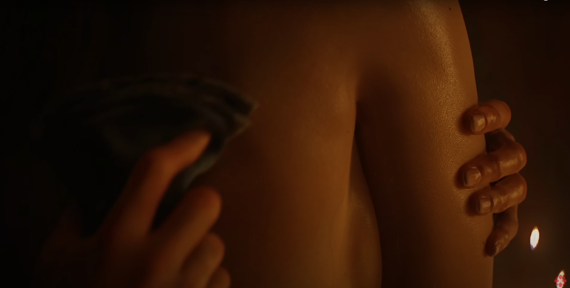
And then a lady being washed. We can imagine the softness and warmth of the cloth; perhaps also a chill in the air.
Meanwhile, we hear the sounds of water and a crackling fire. These textures bring us into the world, give us a sense of what it would be like to be there in the room. It’s a subtle way of worldbuilding that doesn’t require any words. Texture can be just visual, but it’s even better when it’s accompanied by excellent sound design.
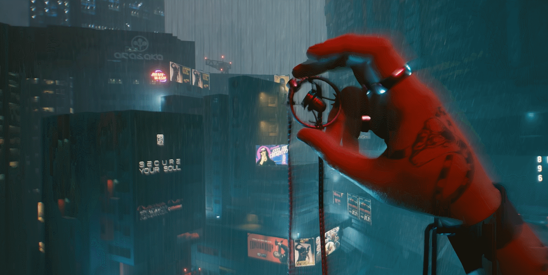
Cyberpunk 2077 uses texture but in a techy, futuristic, and psychedelic way. It similarly sells you on the world, even though elements of it are not relatable. We can still get a better sense of what it would be like to experience it.
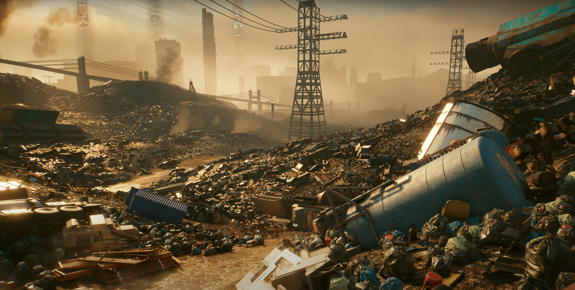
This establishing shot immediately conveys how grimy, smelly, polluted and overextended the world is. It doesn’t just tell you the city has a polluted junkyard – it shows it, with rich textures that give you a sense of what it feels and smells like, just from looking.
Here we see a completely different side of the city – way more glamorous. Water adds a strong textural element, feeling cool and fresh. Combined with that crisp sunrise over the city skyline, it creates a beautiful scene that emphasizes the feeling of a cold morning.

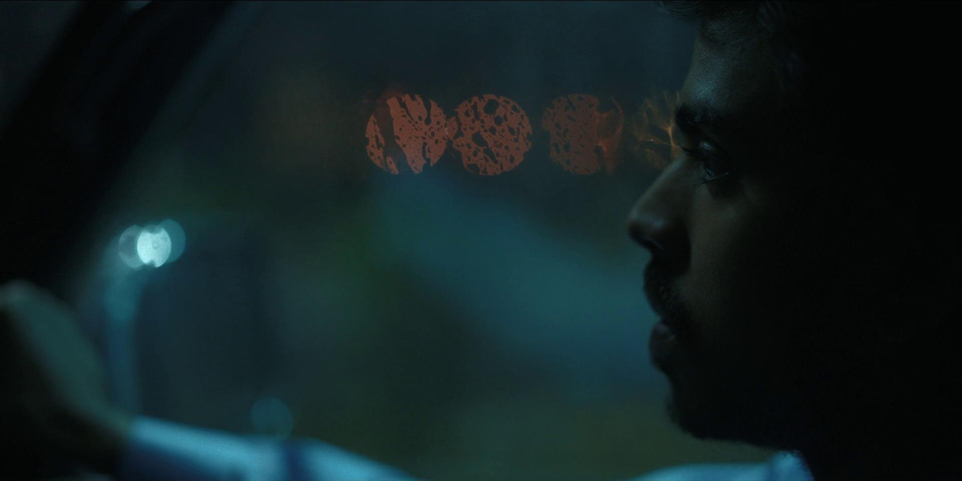
In this image, we can see what happens when our character is damaged: a red overlay appears, as if the tech in his head is glitching. Using an overlay like this for a first-person character isn’t new, but it’s an effective, immersive way to signal that the player is close to dying. It mimics the loss of vision someone might get from a serious hit. Here, the glitch fits perfectly with the game’s cyberpunk aesthetic. By establishing a clear setting and reinforcing it with textures wherever possible, you give your game a distinct, recognizable feel — even in a single frame.

This shot from the trailer feels simultaneously like an old-school computer glitch and a psychedelic experience. It’s a great example of a distinctive, textured effect that perfectly suits the game’s setting.
Texture doesn’t always have to be realistic or something we have felt before. In some cases, you can get away with creating a completely new style of textures, and people still relate to it. Minecraft is a great example of this – you can almost touch it, like it’s made of LEGO. Every block has a sound effect, and it has such a distinct feeling. Because of this, it has become completely iconic and timeless.

Source: Official Minecraft Trailer
A big amplifier of texture is lighting. It sets the tone – selling a scene as a cold, wet morning, or a hot summer day – and it makes highlights sparkle. It brings out the lushness in foliage and the shapes of your landscape.

Things like lens flares, mist, god rays and particles can add texture – layers of interest and shine – to your images in subtle ways. If you imagine the following image without the light filtering through the waves, without the godrays and particles, it would be a dryer, less impressive image.

Lens effects, like bokeh and bloom, will also help you get to where you need to be. In this case, the horizontal flare is a lens effect, and the eyes are super bloomy as well. Bloom is a post-processing effect that adds a bright, hazy glow around a light source, creating drama and intensity that wouldn’t otherwise be there.

Bokeh is what happens when you use a narrow depth of field and the blurry background light begins to form shapes and blurs together in an aesthetic way. It's not just the blur itself, but the pleasing, soft, and often circular quality that makes a subject stand out. Good bokeh can dissolve distracting clutter, add emotional depth, and transform out-of-focus lights into attractive, creamy tones or glowing highlights.

As long as photography has existed, people have tried doing all sorts of things to achieve cool effects. They put different kinds of filters on their lenses, they hold up prisms or glass cups and photograph through them. They add a shape to the lens to create a distinct shape in the bokeh. Sometimes people apply Vaseline to a filter to place it on the lens, this gives a soft, dreamy effect.
People like collecting old, strange cameras that produce fun and unexpected images. Others prefer to shoot on film and use techniques to alter the results at the developing stages. There are loads of possibilities, yielding unique and sometimes very beautiful-looking results. The true fun lies in the unpredictability of the final image.
Director Bertrand Mandico, who likes to be experimental with his imagery in his films, used a variety of filters on his cameras in his film, “The Wild Boys”. He doesn’t like to rely on post-production, so he worked together with his director of photography, Pascale Granel, to create these dreamy-looking images straight out of the camera, giving their movie a distinct look and texture.
When we look at digital art created in a game engine, lens effects can be mimicked by post-processing effects. They are usually used in moderation because they can interfere with the playing experience. That doesn’t mean that experimental games don’t exist. Dujanah, for example, is a strange-looking Claymation game that has incredible texture and personality.

“Lens effects” or post-processing effects that look like lens effects sometimes get used in mainstream games. Here, Geralt from The Witcher has drunk a little too much. As a result, he waddles around, and the player has to squint through an intense-looking scene.

Finally, we come to patterns and texture. Patterns are visually satisfying and very recognizable. A great example is Stardew Valley, where part of the fun in designing your farm is creating these visual patterns with your crops. The designers used tiling textures for elements like paths and ground, which creates a very cohesive and pleasing aesthetic throughout the game world.

Source: Stardew Valley Trailer
There are countless ways to add texture to your experience, and it’s a good idea to keep an eye out for opportunities to enhance it. It just makes for a better, more immersive and memorable experience.
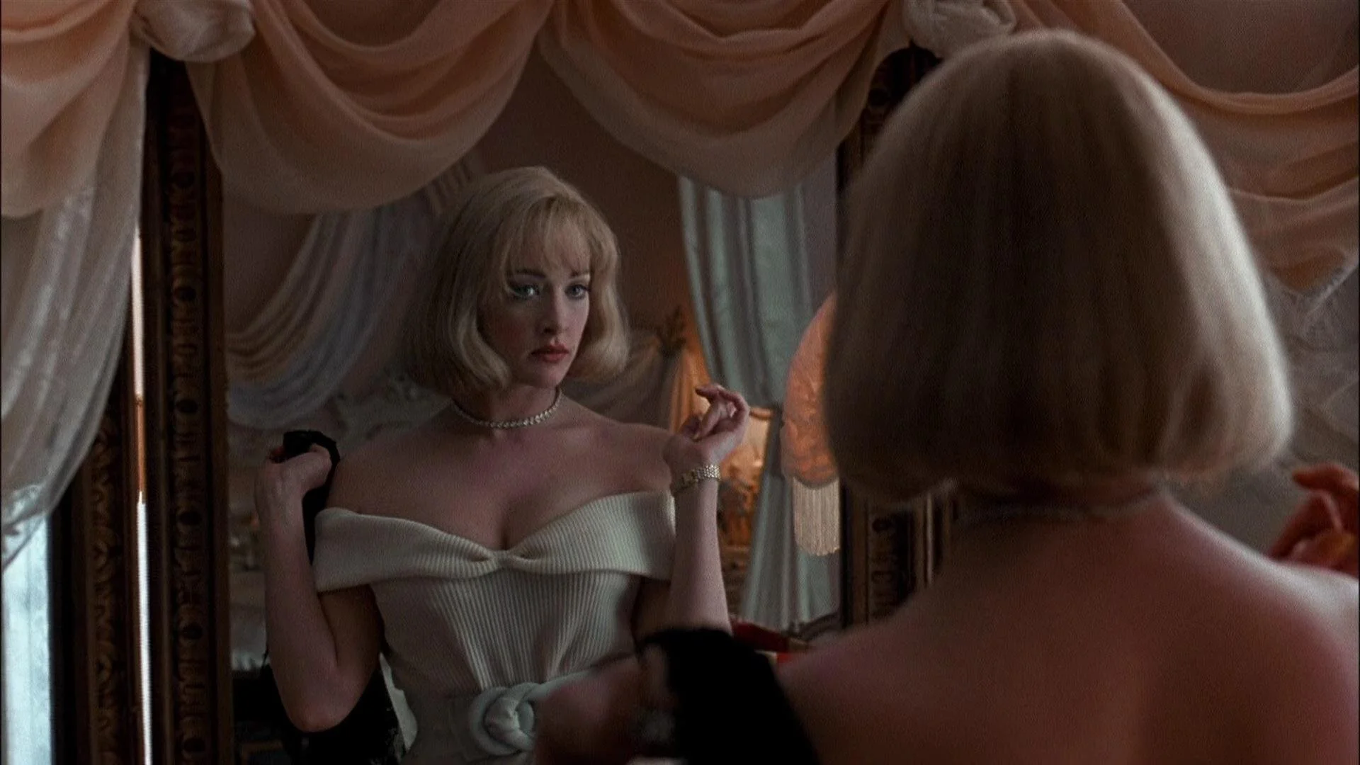
Going for the unexpected
Oftentimes, being creative and doing something weird is just more fun! It surprises the viewer and keeps them on their toes.
In this case, they could have just filmed the shooter, but showing him reflected in the glasses is a far cooler shot. This choice is highly impactful as it implies we are seeing the last image the victim saw before the bullet hit.

Source: Wanted
Another example of a creative shot comes from Arcane, where the main character is talking to herself in a broken mirror during a psychotic episode. The fractured mirror immediately sold us on her broken state of mind. The symbolism was lost on no one. It's creative, looks compelling, has great texture, and, most importantly, drives the story forward.

Source: Arcane
It was also interesting to see the motif come back in a slightly different form with another character.

Source: Arcane
To conclude…
There are countless ways to craft a compelling composition, with plenty of tricks you can mix and match to tell your own creative stories. In general, it’s a good idea to be mindful and take a moment to consider how you place your elements and what you add to them. Do the main elements stand out? Are they arranged harmoniously? Could more texture enhance the scene, or bring it closer to the overall mood? Or maybe there’s room to do something unexpected!
I hope this article has given you a clearer sense of the building blocks behind great composition — and some fresh ideas to try in your next project.
Thanks for reading until the end!
All trademarks and copyrighted imagery are the property of their respective owners and are used here for educational and analytical purposes.